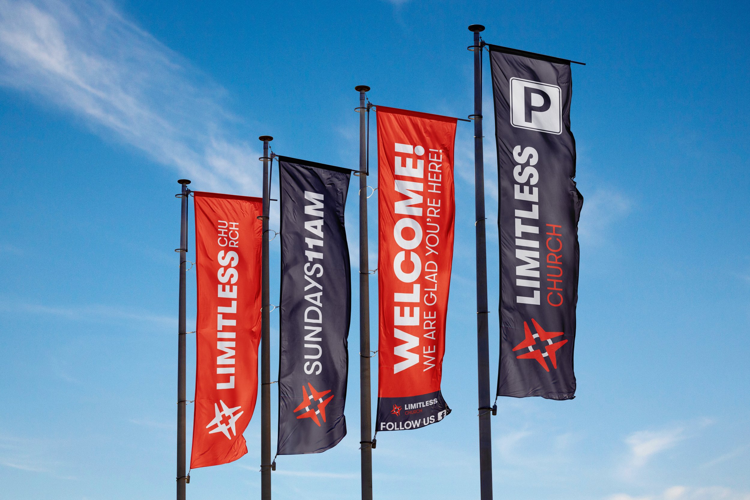
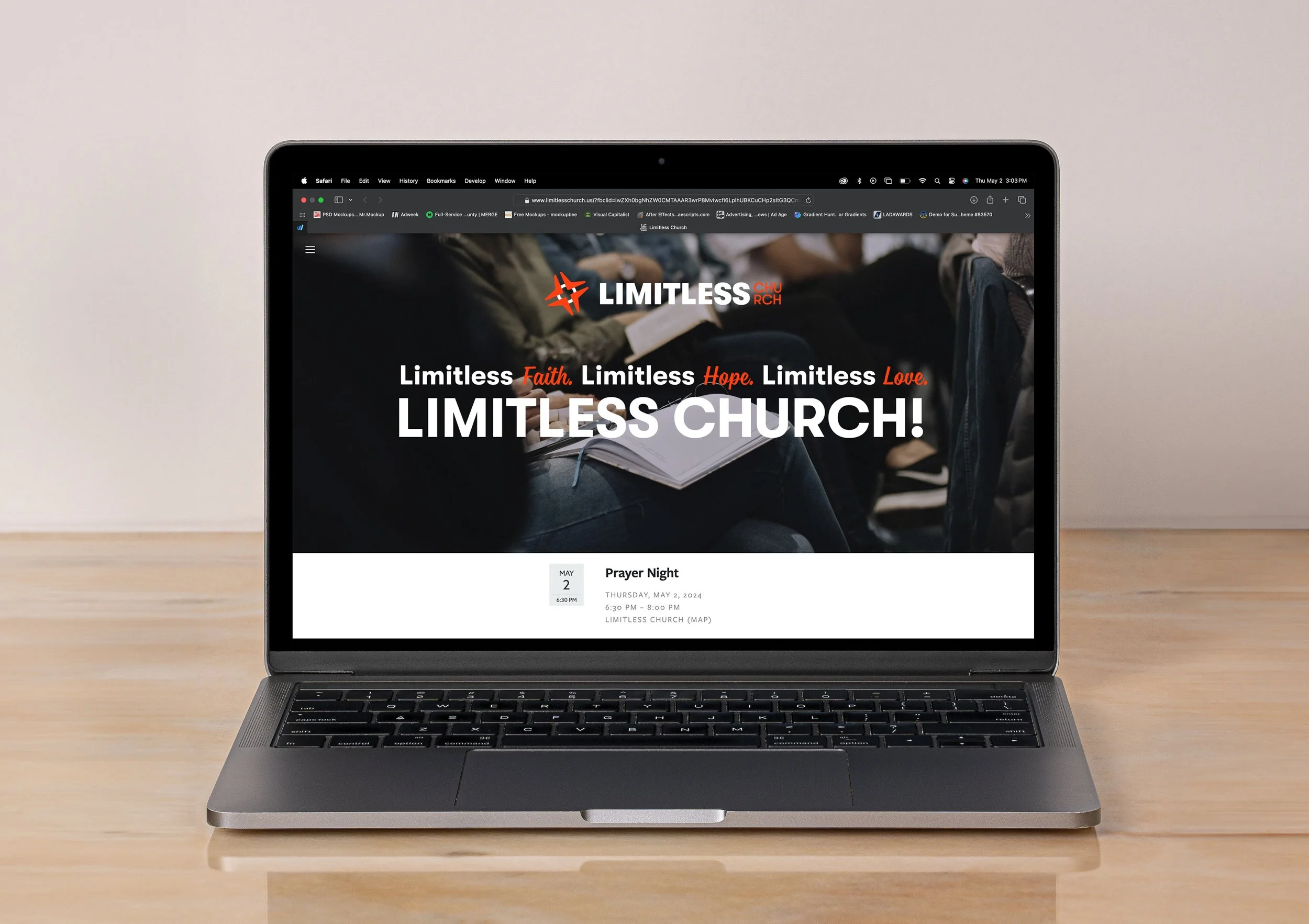
Limitless Church™
Rebranding
Client: Limitless Church
Disciplines: Branding, Brand Strategy, Art Direction, Social Media Design
The redesigned logo of Limitless Church is a fusion of symbolism and minimalist design. At the center stands a cross, its extended arms reaching out in four directions, signifying the church's outreach and connection to the cardinal points of human experience: spiritual, physical, intellectual, and emotional. The cross is more than a Christian symbol; it’s a meeting point of paths, representing the church's role as a guide and refuge.
Intersecting the cross are two dynamic hash marks, suggesting a digital touchpoint or a location marker on a map, grounding the church in the modern era of global positioning and digital community. This element speaks to the church’s mission to be a spiritual waypoint in the digital age, accessible to all seeking direction.
The overall design radiates contemporary sophistication. It’s a visual testament to the Church's blend of enduring faith and innovative engagement, aiming to navigate the complexities of contemporary life with timeless wisdom and an inclusive spirit.